
Holiday Color Combinations That Actually Work for Warm-Weather Trips

Why Holiday Color Combinations Matter More Than You Think
Holiday color combinations decide whether your suitcase works for you or against you. On a trip, you rewear pieces more than you would at home, so the colors you pack need to mix and match without looking repetitive. A smart approach is to choose one neutral base, one deeper accent, and one bright pop, then build every outfit from that trio. This keeps your bag small and your outfits varied, which matters when laundry access is limited and you want every piece to earn its spot.
Key takeaways
- Build a trip palette around one neutral base, one deeper accent, and one bright pop color.
- Sand and ocean blue, white and a saturated color, and olive with cream are reliable day-to-dinner pairings.
- Limit your whole trip to three or four colors to cut packing weight and decision fatigue.
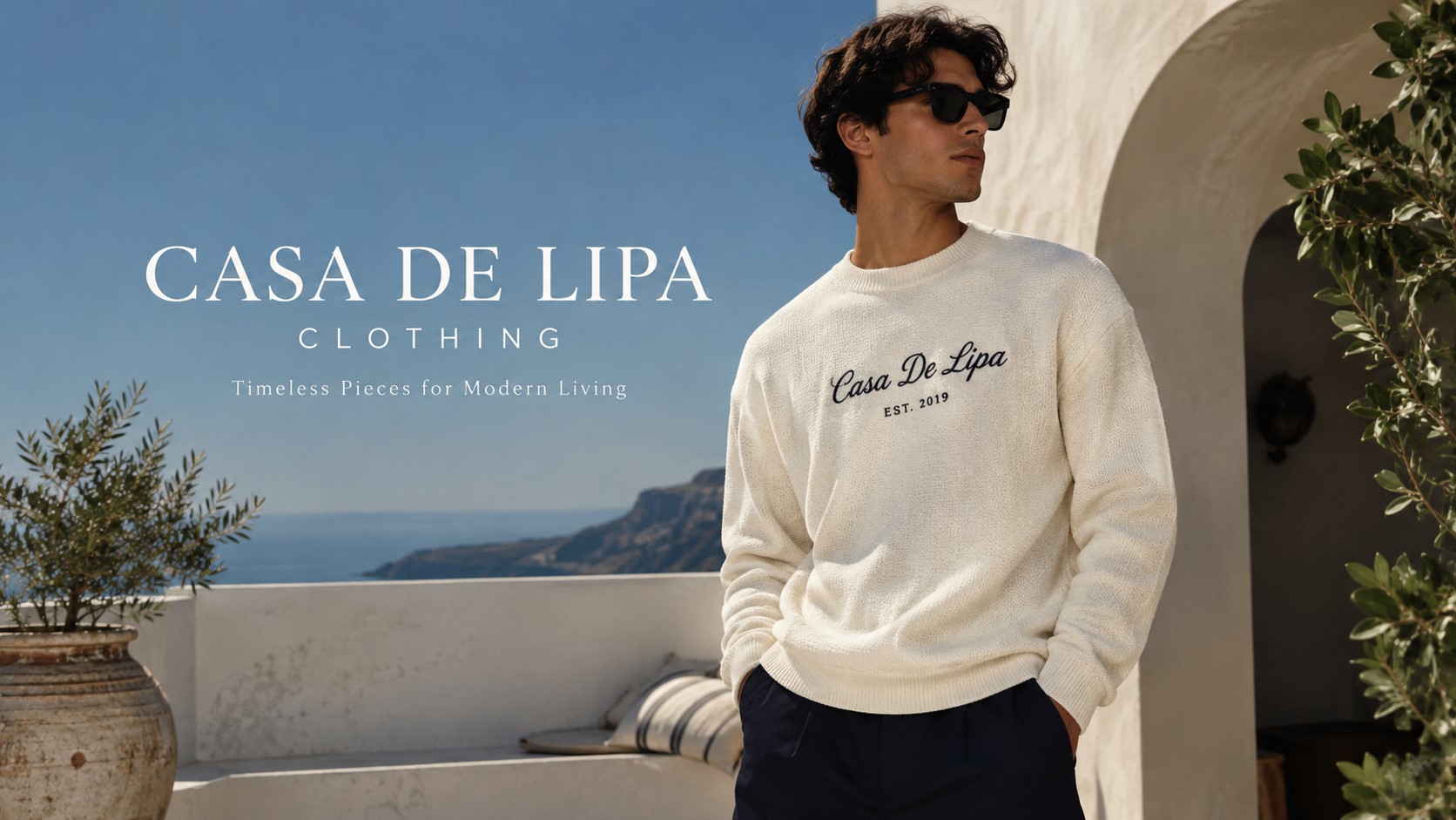
Think about where the trip takes you. Beach towns favor lighter, sun-washed tones, while a city break might call for something with more contrast. A good starting point for building this kind of travel wardrobe is casa de lipa, which carries clothing pieces that work well as the neutral base for a color-coordinated suitcase. Keep your prints minimal and let color do the styling work instead, since patterns are harder to repeat across multiple outfits without looking busy or mismatched.
A good starting point for building this kind of travel wardrobe is casa de lipa, which carries clothing pieces that work well as the neutral base for a color-coordinated suitcase.
Classic Pairings for Beach and Resort Days
White and a single saturated color is the easiest formula for resort style. White shorts or a white dress let a coral top, a cobalt swimsuit, or a deep green sarong stand out without competing for attention. This pairing photographs well too, which matters if the trip is one you want documented without constant outfit changes.
Pair it with simple white accessories, including a small item like a casa de lipa card holder, and you have an outfit that moves from a beach walk to a dinner reservation without a wardrobe change.
Sand tones paired with ocean blue are another reliable combination, especially for beach days that run into evening. A beige linen shirt over navy or teal swim trunks reads relaxed but intentional. For women’s pieces, a cream slip dress with turquoise accessories does the same job. These pairings work because sand and blue sit near each other on a mood board already, so almost any shade of either will blend without clashing.
Soft pastels, pale pink, light yellow, mint, also pair nicely with white or tan. They feel appropriate for daytime but can look washed out under harsh midday sun, so save bolder versions of these colors for sunset hours when the light softens everything anyway.
Combinations That Carry You From Day to Dinner
A color combination that works at breakfast and still looks right at a beachfront dinner saves real suitcase space. Olive green with cream is one of the most versatile pairings for this. Olive reads casual with sandals and structured with a slight heel, and cream never looks out of place next to it, indoors or out.
Terracotta and white function the same way. Terracotta has enough warmth to suit golden hour light but enough depth to hold its own under restaurant lighting. Pair it with simple white accessories, including a small item like a casa de lipa card holder, and you have an outfit that moves from a beach walk to a dinner reservation without a wardrobe change.
Navy and white remain dependable because navy photographs as formal or casual depending on the cut of the piece. A navy linen shirt feels relaxed at lunch, sharper when tucked in for evening. Keep accessories minimal in these day-to-night combinations, since the outfit is already doing enough visual work on its own.
Building a Full Trip Around a Few Key Colors
The most efficient holiday packing plans limit the palette to three or four colors total. Choose two neutrals (white, beige, or navy) and two accent colors that share an undertone, like coral and terracotta, or teal and sage. Every top should pair with every bottom, which cuts down decision fatigue once you’re actually on the trip.
Holiday color combinations work best when they respect the setting as much as the season. A tropical destination can handle brighter accents than a coastal town with cooler evenings. Pack one statement piece in your boldest color and build the rest of the trip around supporting neutrals, so that one item always feels fresh rather than lost in a repetitive rotation.
Test your planned combinations before you pack by laying pieces out together, not just checking them individually against a mirror. Colors read differently side by side than they do alone, and five minutes of planning at home saves a lot of second-guessing once you’re unpacking in a hotel room.
Frequently asked questions
What colors work best for a beach vacation wardrobe?
White paired with one saturated color, like coral or cobalt, is the easiest starting point. Sand tones with ocean blue are also dependable since they sit close together on the color wheel and rarely clash.
How many colors should I pack for a week-long trip?
Three to four colors total is usually enough. Two neutrals, like white and navy, plus two accent colors that share a similar undertone let every top pair with every bottom.
Do pastel colors work for holiday outfits?
Pastels work well for daytime but can look washed out in strong midday sun. They tend to look better in the softer light of early morning or sunset.